

Widget Support
See which Figma patterns convert into which LVGL widgets today, and which ones are on the way, so you know what to expect before you export.
Not every layer needs to become something special. Most come across as plain containers and text. But when a layer is really a control (a slider, a switch, a checkbox), you tell the plugin so in Annotate mode, and the converter turns it into the matching LVGL widget.
This page is the reference for that mapping: what converts today, what each widget is meant for, and what's still coming.
What converts today
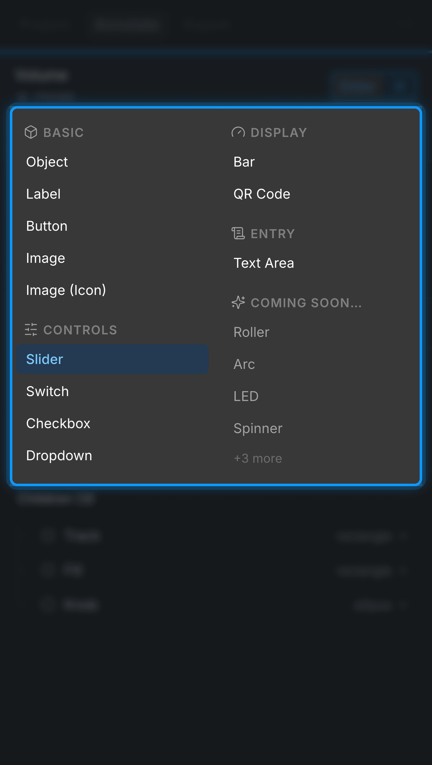
The picker groups widgets into four families (Basic, Controls, Display, and Entry), the same grouping you see in Annotate mode. Everything in the tables below is built into the converter and produces real LVGL output now.
Basic
The everyday building blocks: containers, text, and images.
| Pick this | Becomes | What it's for | You'd usually draw it in Figma as |
|---|---|---|---|
| Object | lv_obj | A plain container or panel that groups other layers | Any frame or rectangle you use to box things together |
| Label | lv_label | On-screen text | A text layer |
| Button | lv_button | A tappable control | A frame or rectangle with a label, often with variants for its states |
| Image | lv_image | A picture or photo | A layer with an image fill |
| Image (Icon) | lv_image | A line or monochrome icon | A vector layer: the plugin uses the vector inside as the icon's source |
Controls
Interactive widgets the user drives, the ones you'll most often point at live data.
| Pick this | Becomes | What it's for | You'd usually draw it in Figma as |
|---|---|---|---|
| Slider | lv_slider | Drag to set a value in a range | A track with a handle |
| Switch | lv_switch | An on/off toggle | A pill-shaped toggle, often two variants |
| Checkbox | lv_checkbox | A checked / unchecked box | A small box next to a label |
| Dropdown | lv_dropdown | Pick one option from a list | A field that opens a list of choices |
Display
Widgets that show a value or status but aren't dragged by the user.
| Pick this | Becomes | What it's for | You'd usually draw it in Figma as |
|---|---|---|---|
| Bar | lv_bar | A progress or level indicator (read-only) | A track with a filled portion |
| QR Code | lv_qrcode | A scannable code | A placeholder square |
Entry
Widgets for typing or entering values.
| Pick this | Becomes | What it's for | You'd usually draw it in Figma as |
|---|---|---|---|
| Text Area | lv_textarea | An editable text field | An input field with placeholder or entered text |
Pointing widgets at live data
Many of these widgets can watch a value that changes while the UI runs, instead of showing whatever you typed in Figma: a label's text, a slider's value, a switch's on/off. You set that up on the summary card under Subject Binding; Subjects & data binding covers which widget binds to what and how the value is formatted.
On the way
A handful of widgets appear in the picker but show up dimmed. You can see them, but you can't pick them yet. They're planned and we will be rolling these out soon.
When a layer isn't a widget
Most of your file is exactly this case, and that's fine. Any layer you don't annotate (a
background, a divider, a decorative shape) still converts. It just comes across as a plain
Object (lv_obj) or a Label, carrying its size, position, and style. You only
reach for the picker when a layer is genuinely a control and you want it to behave like
one.
Last updated on
Updating & File Ownership
Re-export as often as you like: the service regenerates its own files while leaving anything you've taken over untouched, so your hand edits are always safe.
Widget Properties
What each widget's settings mean (a slider's min, max, and orientation, a dropdown's options, a QR code's data), plus how widget states like pressed and checked work.