

Subjects & Data Binding
Point a widget at a live value so it updates at runtime instead of showing a frozen design value, and bind a component's variants to a value so one number swaps its whole look.
Most of what you design is static: a label reads "72°", a switch is drawn on, a slider sits at 60%. Those are fine as starting values. But real UIs change while they run: the temperature updates, the toggle flips, the progress moves.
A subject is how you say "this part shows a live value." It's a named value in LVGL that your UI watches; when your firmware changes the subject, every widget bound to it updates on its own. You can learn more about it in Subjects & Data Binding.
Two kinds of binding
There are two things you can point at a subject, and they solve different problems:
Bind a value
A single widget reflects a live value: a label's text, a slider's position, a switch's on/off. Covered first, below.
Bind variants
A multi-variant component swaps which variant it shows based on a number, and one subject drives its whole appearance. Covered in the second half.
Bind a value
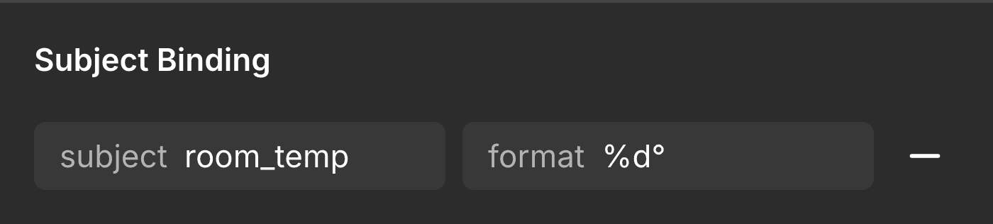
Select a bindable widget and you'll see a Subject Binding row:
- Subject: the name of the live value (e.g.
room_temp,wifi_on). Typing a name is what turns the widget dynamic; leave it blank and the widget keeps its drawn value. - Format (labels only): an optional pattern for how a label renders its value as
text (e.g.
%d°renders72as72°). See the format reference below.
You give one subject name; the plugin picks the right LVGL attribute for you based on what the widget is:
| Widget | What binds to the subject | Value type | Format field? |
|---|---|---|---|
| Label | its text | string (or a number via Format) | yes |
| Image | its source (which image shows) | string | no |
| Slider, Bar | its value | integer | no |
| Switch, Checkbox | its on / off state | boolean | no |
| Dropdown, Roller | its selected index | integer | no |
The Format field appears only on labels, because a label is the only widget that renders its subject as text. A slider, switch, image, or dropdown reflects the value directly (as a position, an on/off, an image, an index), so there's nothing to format.
Subjects come in three kinds (integer, string, and boolean), and the
plugin infers which from the widget and format. (A boolean is stored as 0 / 1.)
Formatting the value
The Format field (on labels) is a small pattern with a placeholder for the value. You'll rarely need more than the first two:
| Format | Use it for | Value | Shows |
|---|---|---|---|
%d | a whole number | 72 | 72 |
%s | text | Kitchen | Kitchen |
%% | a literal percent sign | (none) | % |
Put your own text around the placeholder and it comes through as-is:
| Format | Shows |
|---|---|
%d° | 72° |
%d%% | 50% |
$%d | $5 |
%s room | Kitchen room |
Numbers here are whole numbers (an integer subject) and text is a string. There's no decimal format, because subjects hold whole numbers or text, not fractions. Leave Format blank for plain text with no pattern.
Bind variants to a subject
This is the powerful one. Say you built a status chip as a Figma component with several
variants (Charging, Standby, Fault), each a different color and icon. Instead of
shipping three components and swapping them by hand, you can collapse the whole set into
one component whose look is driven by a single number.
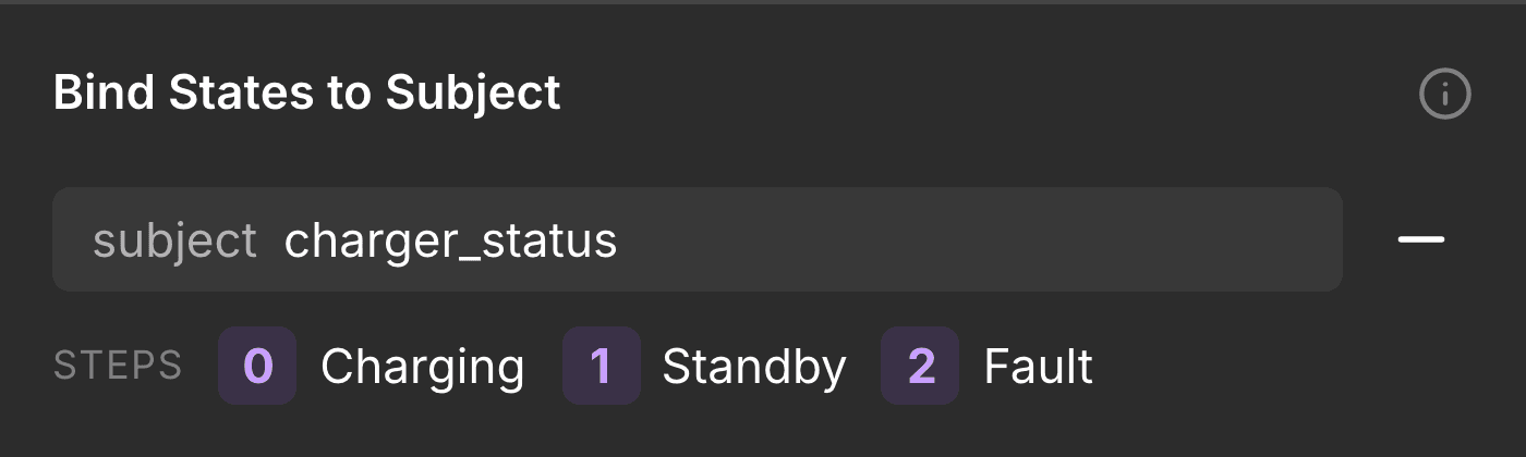
Select the component set and its card offers Bind States to Subject. Turn it on, give the subject a name (or accept the suggested one), and that's it: the card shows a read-only Steps list of how each variant maps to a value.
The mapping is 0-based
Each variant becomes an integer, starting at 0, in the order the variants are declared:
| Value | Variant |
|---|---|
0 | first variant (Charging) |
1 | second variant (Standby) |
2 | third variant (Fault) |
The index starts at 0, not 1: 0 is the first variant, 1 the second, and so on.
At runtime you select one with lv_subject_set_int(&your_subject, N), where N is that
0-based value. The generated file even prints the map (0=Charging, 1=Standby, …) in a
comment so it's easy to reference.
When you can use it
Variant binding is offered only when the component set has one variant axis and its values are plain names (not state words like Hover/Pressed, which are handled differently; see below). You need at least two variants. Instances of a bound set are read-only, so they all follow the shared subject.
See every subject in your file
Once you've bound a few widgets, it helps to see everything in one place. The All Subjects button in the Annotate sub-bar opens a file-wide list of every subject the plugin found across both kinds of binding above.
Each row shows the subject's name, its type (integer, boolean, or string), and how many places bind it. Expand a row to see each usage: the node, its format (for a label) or type, and which screen or component it lives in. Click a usage to select it on the canvas. Use Refresh (top-right) to re-scan after you've bound more widgets.
Type conflicts
A subject can only be one type. If two bindings disagree, say a Bar (integer) and
an Image (string) that share the same subject name, the row is flagged conflict.
Fix it before exporting, by renaming one of them or making them agree; otherwise the value
won't bind the way you expect.
Different formats on the same subject are fine and never flagged: two labels can show
battery as %d%% in one place and %d total in another. Those are just different ways
of printing the same integer, so the type is what must match, not the format.
Subjects aren't states
There's a related-but-separate feature worth not confusing with this. Binding variants to a subject (above) is for content you switch by value: a status, a mode, a page index.
States, such as pressed, checked, and disabled, are different: they're the interaction looks a widget takes on its own, and you express them by drawing state variants (an On switch, a pressed button). The converter stays faithful there too: it only styles a state if you drew it. That's covered in Widget properties.
Rule of thumb: reach for a subject when your app decides what shows (a value, a mode). Reach for a state variant when the user's interaction decides it (pressed, on).
Where to next
Last updated on
Annotating
Tell the plugin what your layers really are (a slider, a switch, a label) and point live layers at their data, so the conversion matches what you designed.
Inspect Styles
Read any layer's LVGL style straight from Figma and copy it into your XML: colors, borders, radius, and size, with no export needed.