

Annotating
Tell the plugin what your layers really are (a slider, a switch, a label) and point live layers at their data, so the conversion matches what you designed.
A rectangle with a rounded fill could be a button, a card, or a progress bar. You know which. The plugin can only guess. Annotate mode is where you settle it: you point at a layer and say what it is, and, when it shows live data, where that data comes from.
You never write code here. You're adding hints.
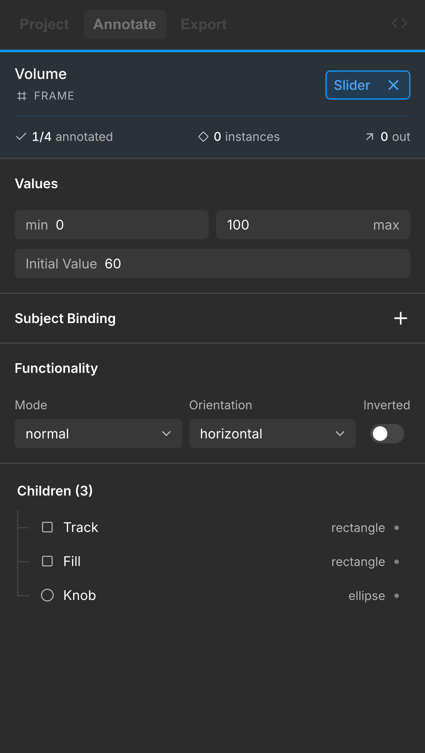
How annotating works
Annotate mode follows your selection on the canvas. What you see depends on what you have selected.
- Nothing selected: a gentle prompt to pick a node on the canvas, or open the components list to browse. Nothing to do yet.
- One layer selected: a summary card for that layer, showing its name, its Figma layer type, and a few metrics, followed by a list of its children. The surrounding UI dims so the card is the focus.
Everything you set lives on the summary card. Select a layer, fill in what it is, move on to the next.
What you can tell the plugin
Here's what a summary card lets you add to a layer. You'll rarely need all of it. Most layers just need a widget type, and only the interactive or data-driven ones need more.
Widget type
The main question: what is this layer in LVGL terms? A widget is just an on-screen control: a button, a slider, a switch, a label. The plugin picks the most likely widget for you, and you confirm it or change it in a two-column widget picker.
Widget params and icon overrides
- Widget params: some widgets have their own settings (a range, a step, a starting value).
Mixed-style text
Got a text layer with more than one style inside it (a bold word in a sentence, a colored number)? You choose how it should come across:
- Span Group: one label that keeps the mixed styling inline.
- Single Label: flatten it to one style.
- Separate Labels: split each styled run into its own label.
Some widgets show dimmed and can't be picked yet. See Widget support for details.
Components, variants, and instances
Components work a little differently, and knowing the rule saves a lot of clicks: annotate the component once, on its definition. The widget type belongs to the component itself, not to every place it appears.
- The definition carries the type. Select the main component (or component set) and tell the plugin what it is, say a Switch or a Button. That becomes the component's type from then on.
- Its children don't need their own type. The layers inside a component (a label, an icon, a track) aren't annotated separately. They come across as the widget's parts and content, carrying their visual properties (color, size, style) into the output.
- Variants fold in automatically. A component's variants become states or a subject-driven look, covered in Variants, states, and subjects above.
- Instances inherit everywhere. Place the component into a screen and every instance follows the definition. On an instance the fields are read-only, with a shortcut to the main component, so you set the intent in one place and every copy updates.
Start over on a layer
Changed your mind? Reset clears every annotation you added to that layer and returns it to the plugin's own guess. It asks for a second click to confirm, so you won't wipe it by accident.
Where your annotations live
Everything you set here is saved onto the layer itself, tucked into Figma's own per-layer plugin storage. That means:
- Your annotations travel with the file: reopen it later, on another machine, and they're still there.
- They don't change your design: nothing visual moves; you're only attaching intent.
- Teammates who open the same file see the same annotations.
Next steps
Last updated on
Exporting
Send your design tokens, components, screens, or whole prototype flows from Figma to LVGL Pro Editor with one click.
Subjects & Data Binding
Point a widget at a live value so it updates at runtime instead of showing a frozen design value, and bind a component's variants to a value so one number swaps its whole look.