

Widget Properties
What each widget's settings mean (a slider's min, max, and orientation, a dropdown's options, a QR code's data), plus how widget states like pressed and checked work.
When you assign a widget type in Annotate mode, some widgets carry a few settings the plugin can't read from the drawing alone: a slider's numeric range, a dropdown's option list, a QR code's data. This page is the reference for those settings, and for how widget states (pressed, checked, and friends) come across.
The plugin fills in a smart default for most settings from your design: it reads the knob position for a slider's value, the drawn ratio for a bar, the shown text for a dropdown's selection. You only need to set a value when the drawing can't reveal it (a slider's true range) or you want to override the guess.
Widgets with no settings
The Basic widgets (Object, Label, Button, Image, and Image (Icon)) take no settings here. They're built entirely from your design: size, color, text, and image come straight from the layer. (A Label can still be made dynamic, see Subjects & data binding.)
Controls
Slider
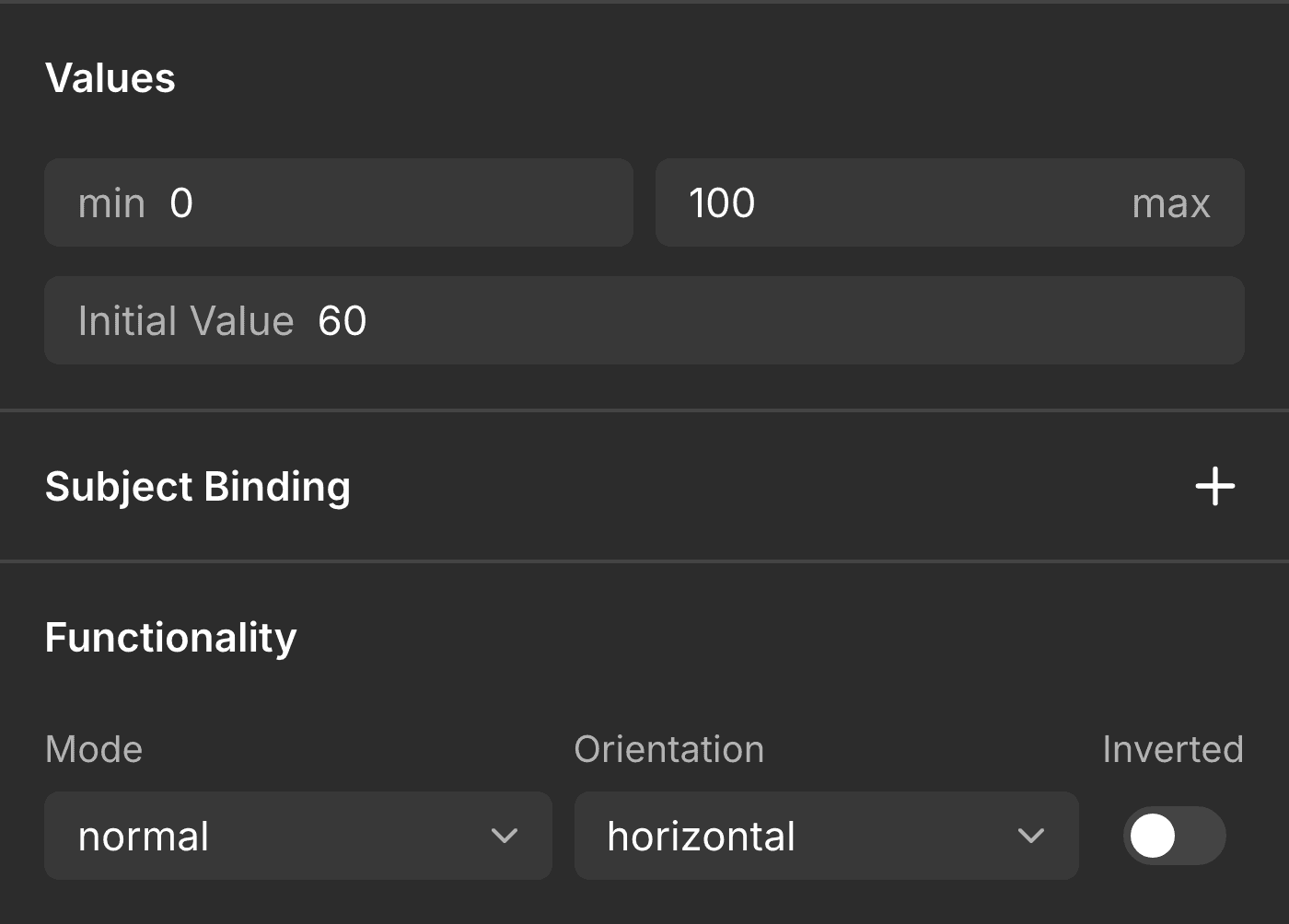
| Setting | What it does | Values |
|---|---|---|
| Min value | The low end of the range. Worth setting, since the drawing can't reveal the true scale. | integer, default 0 |
| Max value | The high end of the range. | integer, default 100 |
| Value | Starting value. Auto = derived from the knob's position along the track. | integer |
| Mode | normal, range (two knobs), or symmetrical (fills out from the middle). | enum; range is auto-detected from two knobs |
| Orientation | Auto = taken from the frame's aspect. | horizontal, vertical |
| Inverted | Fill from the opposite end. | on / off |
Bar
| Setting | What it does | Values |
|---|---|---|
| Min value | The low end of the range. | integer, default 0 |
| Max value | The high end of the range. | integer, default 100 |
| Value | Starting value. Auto = the drawn indicator/track ratio. | integer |
| Mode | normal, symmetrical, or range. | enum |
| Orientation | Auto = from the frame's aspect. | horizontal, vertical |
| Inverted | Fill from the opposite end. | on / off |
Switch
| Setting | What it does | Values |
|---|---|---|
| Checked | Starting state. Auto = the drawn knob/indicator position. | off, on |
| Orientation | Auto = from the aspect. | horizontal, vertical |
Checkbox
| Setting | What it does | Values |
|---|---|---|
| Checked | Starting state. Auto = whether the tick is drawn. | off, on |
| Use drawn glyph | Use your drawn tick/dot as the checked mark instead of LVGL's flat fill. | on / off |
Entry
Dropdown
| Setting | What it does | Values |
|---|---|---|
| Options | The option list, one per line. Auto = read from the drawn rows. | multi-line text |
| Selected | Which option starts selected (by index). Auto = match the shown text. | integer |
| Direction | Which way the list opens. | bottom, top, left, right |
Text Area
| Setting | What it does | Values |
|---|---|---|
| Single line | Constrain to one line. Auto = inferred from a short frame. | on / off |
| Password mode | Mask the input. Auto = detected when the drawn text is all •/*. | on / off |
| Password reveal time | How long a typed character shows before masking (ms). | integer, default 0 |
| Text role | Whether the drawn text is placeholder or real content. Auto = low-contrast text reads as placeholder. | placeholder, text |
Display
QR Code
| Setting | What it does | Values |
|---|---|---|
| Data | The text or URL to encode. Required, because a drawn QR is just an image. | string |
| Quiet zone | Add the white margin around the code. | on / off |
| Dark color | The module (foreground) color. | color, default black |
| Light color | The background color. | color, default white |
The coming-soon widgets (Arc, LED, Spinner, Scale, Roller, Spinbox, Image Button) will each grow their own settings as they ship. See Widget support for what converts today.
States
LVGL widgets can look different depending on what they're doing: a button darkens when pressed, a switch fills when checked, a control greys out when disabled. LVGL has a fixed vocabulary of these states:
- default: the resting look
- checked: on / selected / active
- pressed: held down
- hovered: pointer over it
- focused: has input focus
- disabled: inactive
The plugin stays faithful: it never invents a state look
This is the important rule: the converter only styles a state if you drew it. It does not borrow a pressed or checked look from an LVGL theme. Theme defaults are stripped, and nothing is added back that you didn't design.
So a Switch gets a distinct checked look only if your component has a checked (On) variant. A Button gets a pressed look only if you drew a pressed variant. No variant for a state → that state simply isn't styled, and the widget keeps its one drawn appearance. You get exactly what you designed. Nothing fabricated.
This is why a component's variants matter so much. To give a widget interaction looks, add variants named for the state, and the plugin maps common names for you: On / Active / Selected / Enabled → checked; Disabled / Inactive / Locked → disabled; Hover → hovered; Pressed → pressed; Default / Normal / Rest → default.
How states are matched to the widget
The converter compares each state variant against the default and applies only what
actually changed, to the right part of the widget: a switch's knob and indicator, a
slider's knob and track, a checkbox's box. Under the hood that becomes an LVGL selector
like knob|checked (the knob, in the checked state), but you never write that. You just
draw the variants.
A note on which states carry through: checked and disabled are steady states, so an instance can be exported already in that state. pressed, hovered, and focused happen live on the device from touch and focus. You style them via variants, but they're driven at runtime, not frozen per instance.
Where to next
Last updated on