
This article focuses on one core question: How can we recreate the Apple Watch bubble list interface in LVGL?
This implementation is for learning and reference only. It does not guarantee behavior fully identical to Apple Watch, but it aims to provide a similar user experience in core interaction and visual feedback.
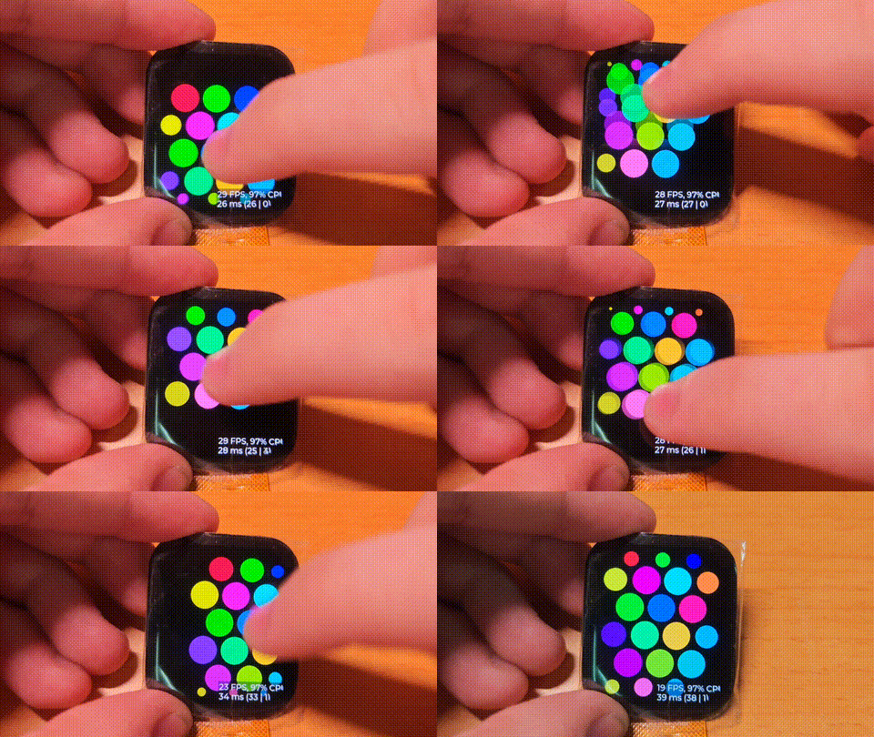
Here is the final result running on actual hardware:
Breaking Down the watchOS Bubble App Layout#
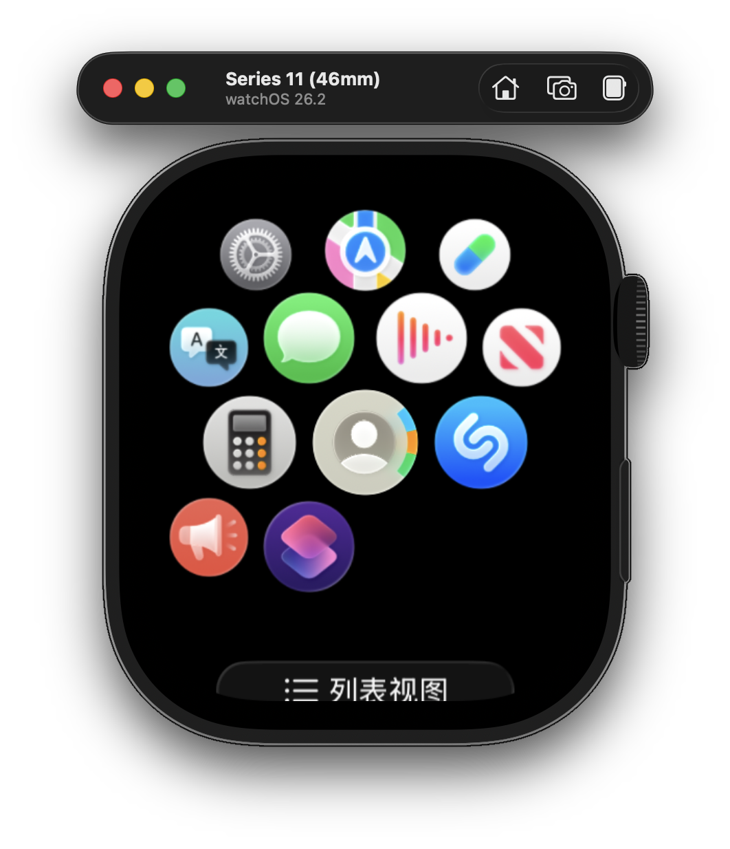
Bubble Arrangement#
The overall layout uses a staggered honeycomb pattern: 3 bubbles on even rows, 4 bubbles on odd rows.
Behavior and Animation#
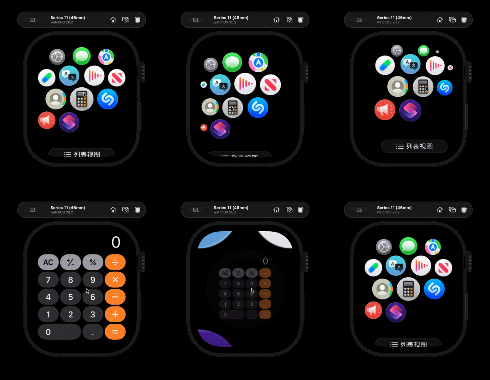
The core visual behavior can be broken down as follows:
- The center area is largest, and size gradually decreases toward the edges.
- Edge icons do not just shrink; they also gather inward toward the center.
- Drag inertia and rebound: while dragging, icons follow the gesture.
- Local tap feedback: the pressed icon shrinks and darkens, and nearby icons are slightly pulled toward the press point.
Reproduction Strategy#
To recreate this effect, start from the most basic layout: create a container lv_obj_t *container, put all bubbles inside it, and arrange icons in the pattern of "3 on even rows, 4 on odd rows." As long as the honeycomb stagger is correct, later animation and scaling have a solid foundation.
Next, build visual hierarchy. Keep icons in the center at maximum size, make them smaller toward the edges, and add a bit of inward pull near boundaries so the edges do not look too sparse. Once "position determines scale" is handled correctly, the overall look will be close to a watch-like home screen.
Finally, add interaction animation. On press, icons should shrink slightly and darken; while dragging, they should follow the finger; on release, velocity should determine whether they rebound or continue with inertia. Tap and drag must be distinguished to avoid accidental taps when the finger sweeps across icons. Once layout, scaling, edge convergence, and input animation are connected, the main effect is essentially complete.
bubble_tick_timer#
This timer is the heart of the entire system. It advances state updates, physics integration, and visual solving every frame. It runs on a fixed time step (for example, 16 ms), ensuring smooth animation synchronized with system time.
Overall Algorithm Flow#
This component is essentially a discrete-time system. Each frame executes: "state update → geometry solve → visual commit."
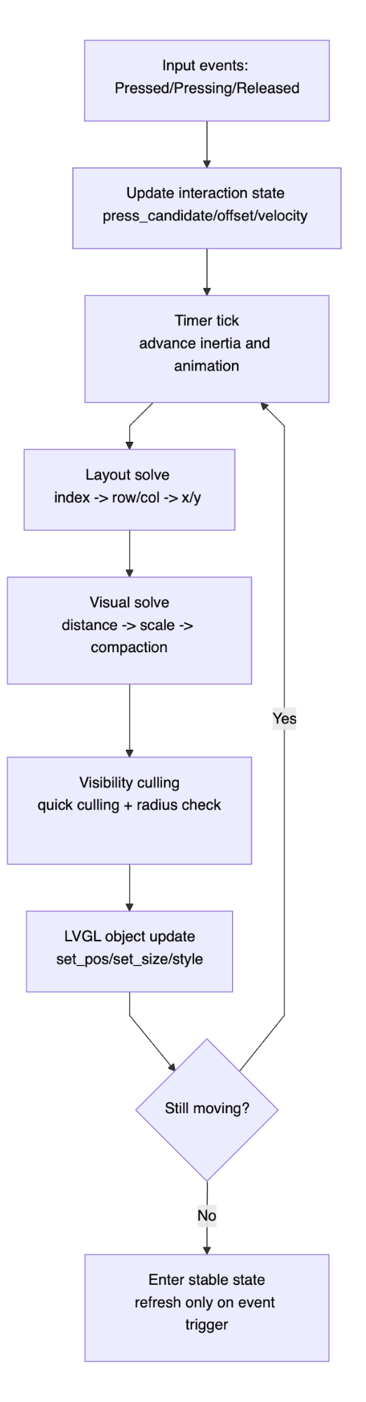
There are three key closed loops in this diagram:
- Input loop: how user actions rewrite state.
- Physics loop: how velocity and displacement converge frame by frame.
- Rendering loop: how state maps to object attributes.
Layout Core: Mapping Index to a Staggered Honeycomb Grid#
Row Pattern#
The grid uses alternating row capacities:
- 3 bubbles on even rows
- 4 bubbles on odd rows
This pattern makes the interface feel closer to the watch home screen rather than a regular matrix.
Mapping Algorithm#
Given an index, subtract row capacities in sequence until the index falls into the current row:
- Obtain
row col = index - consumed
After obtaining row and col, convert them into local coordinates using fixed row and column pitch.
If that still feels abstract, think of it as assigning IDs row by row (0-based index):
- Row 0 has 3 IDs: 0, 1, 2
- Row 1 has 4 IDs: 3, 4, 5, 6
- Row 2 has 3 IDs: 7, 8, 9
- Row 3 has 4 IDs: 10, 11, 12, 13
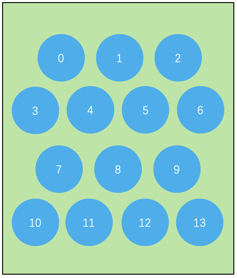
So the location procedure for any index is:
- Start from row 0 and check whether that row can contain the index.
- If not, subtract this row's capacity and continue to the next row.
- The first row that can contain it is
row; the remaining offset iscol.
Only then do geometric mapping: convert (row, col) to pixel coordinates.
rowdetermines vertical layer (multiply byROW_PITCH_Y)coldetermines horizontal position (multiply byROW_PITCH_X)- Subtract the row half-span to keep every row center-aligned
Two coordinate semantics are used in practice:
- Solve stage: local coordinates with container center as origin; bubble coordinates represent bubble centers and may be negative.
- LVGL commit stage: standard LVGL coordinates with container top-left as origin;
lv_obj_set_pos()requires bubble top-left coordinates.
From the implementation perspective, the core logic of row_layout_to_pixel() can be summarized as:
bubble_count = (row % 2 == 0) ? 3 : 4;
row_half_span = (bubble_count - 1) / 2.0f;

x = (col - row_half_span) * ROW_PITCH_X;
y = (row - row_center) * ROW_PITCH_Y;The key term here is (col - row_half_span):
colis the left-to-right column index.row_half_spanis the half-width column count of this row.- Subtracting them converts coordinates from a left-aligned system into a center-aligned system.
row_center    = (min_row + max_row) / 2.0f;
row_half_span = (bubble_count - 1) / 2.0f;
pos_x         = (col - row_half_span) * ROW_PITCH_X;
pos_y         = (row - row_center)    * ROW_PITCH_Y;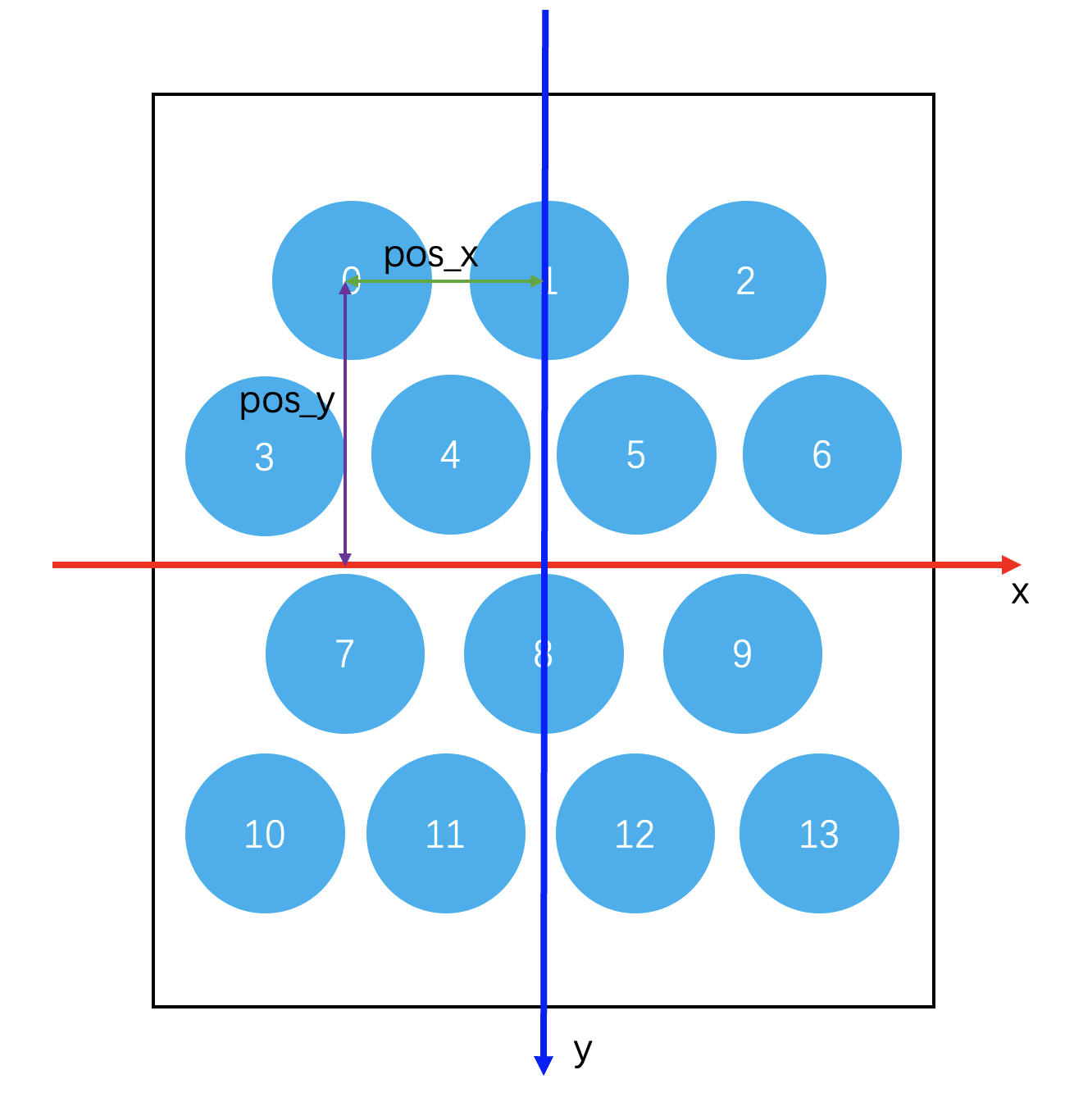
A concrete example:
- If
bubble_count = 3, thenrow_half_span = 1; col=0/1/2 becomes −1/0/1. - If
bubble_count = 4, thenrow_half_span = 1.5; col=0/1/2/3 becomes −1.5/−0.5/0.5/1.5.
Then multiply by ROW_PITCH_X to get the final symmetric x-coordinates around the row center. This prevents odd and even rows from drifting left or right as a whole.
This design yields two practical engineering benefits:
- Any index can be mapped, so dynamic expansion is naturally supported.
- The arrangement rule is function-defined instead of static-table-defined, so changing from 3-4 to 4-5 or another topology has low cost.
Dynamic Vertical Centering#
row_center is not constant. The system computes the midpoint from the minimum and maximum rows that currently have icon resources, ensuring the icon set remains vertically centered as a whole.
This prevents center-of-mass drift when only part of the index range is populated.
Visual Model: Distance-Field-Driven Scaling#
I split the visual model into two distance fields:
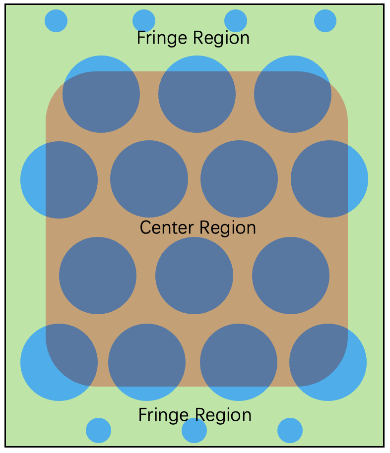
The red center area is the Center Region, and the middle transition band is the Fringe Region.
Bubble scaling is driven by distance to the boundary:
- Center region (
distance <= 0):scale = max_scale - Transition band (
0 < distance <= fringe_width): scale transitions linearly frommax_scaletomin_scale - Edge region (
distance > fringe_width):scale = min_scale
Boundary Shape#
The boundary is not a rectangle, but an approximately rounded rectangle:
X_RADIUSandY_RADIUSdefine the central effective area.CORNER_RADIUScontrols corner curvature.fringe_widthcontrols transition bandwidth from maximum to minimum scale.
Actual Visual Solve Order#
For each icon in each frame, solve in this order:
- Grid coordinates → base x/y
- Add global offset
- Quick culling (drop invisible bubbles first)
- Compute
distance_to_edge - distance → scale
- Boundary compaction and translation compensation
- Secondary visibility check (combined with scaled radius)
This order should not be changed arbitrarily. In particular, doing quick culling before expensive distance computation saves substantial cost.
Edge Compaction and Translation Compensation#
If bubbles only scale, there are two side effects:
- Edge bubbles become smaller, but center bubbles stay large, so edges look too sparse.
- Edge bubble appearance becomes more abrupt than the middle region.
So two corrections are added around scaling:
- Boundary compaction: compress coordinate deltas based on distance to boundary.
- Compact translation: apply a compensating shift along the normal or corner bisector.
Together, these make edges converge without collapsing, preserving the visual tendency to gather toward the center.
The core idea is not to directly shrink "distance between two objects," but to shrink "distance from object to boundary."
More specifically, treat each icon as a point in an ideal coordinate system, then apply an inward nonlinear mapping:
- Points near the center barely move.
- The closer a point is to the boundary, the more strongly it is compressed inward.
- Once a point enters the fringe transition band, compaction intensity increases progressively.
So the final visual result is:
- Edge bubbles appear closer to one another.
- Visual distance between edge and center bubbles also shortens.
- But this is not a uniform global translation toward center; it is position-dependent compaction.
In other words, it is a spatial nonlinear mapping: the closer the input coordinate is to the outer side of the boundary, the larger the compaction coefficient.
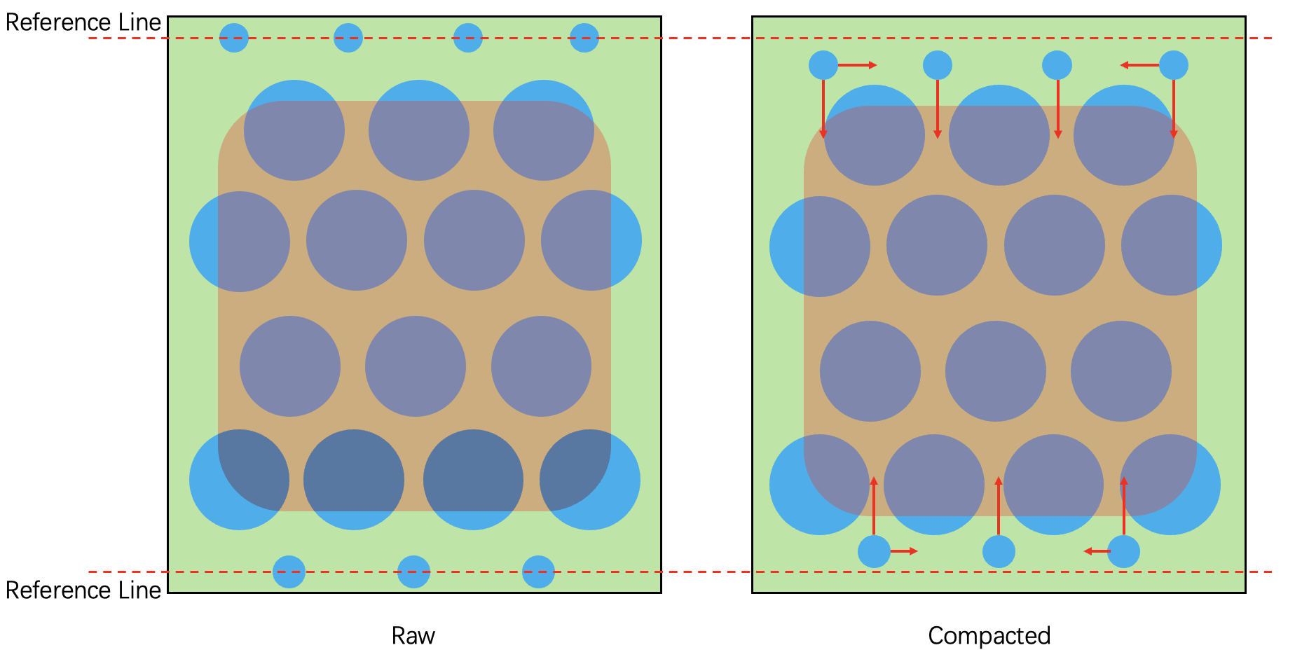
You can think of it as this pipeline:
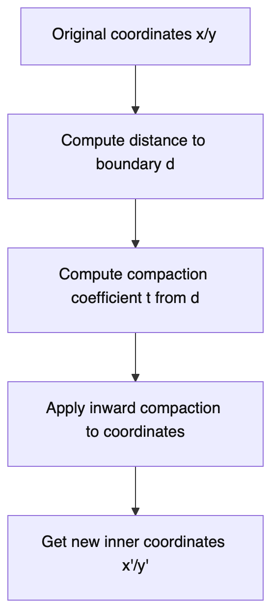
In implementation, compaction is not a single global scaling pass, but two layers:
apply_boundary_compaction(): fold near/outside-boundary coordinates inward to avoid edge over-expansion.apply_compact_translation(): apply additional centerward translation based on point position and boundary distance for tighter visual spacing.
The full compaction workflow splits into five steps:
- Compute boundary distance: for each icon, compute
distance_from_edge; a larger value means the icon is closer to the outer ring. - Compute compaction intensity: map
distance_from_edgeto a compaction coefficient. Center region is almost fixed, compaction grows linearly in the fringe, and gets stronger beyond it. - Apply per-axis fold-back: call
apply_boundary_compaction()separately for x and y to fold overflow beyondX_RADIUS/Y_RADIUSback inward. - Apply directional compensation: call
apply_compact_translation(), compensating along normal or corner bisector according to quadrant, corner status, and boundary distance. - Clamp and commit: limit compensation by
compact_limit, then write back x/y forlv_obj_set_pos().
In code, the order looks like this:
distance_from_edge = calc_distance_to_edge(wb, x, y);

apply_boundary_compaction(&x, X_RADIUS, fringe_width);
apply_boundary_compaction(&y, Y_RADIUS, fringe_width);

apply_compact_translation(wb, &x, &y, distance_from_edge);

/* Final coordinates used by lv_obj_set_pos() */Here, apply_boundary_compaction() handles "how to fold coordinates back when they get too close to the boundary," while apply_compact_translation() handles "how to tighten visual spacing after fold-back." Their combination keeps edge bubbles neither too sparse nor overly crowded.
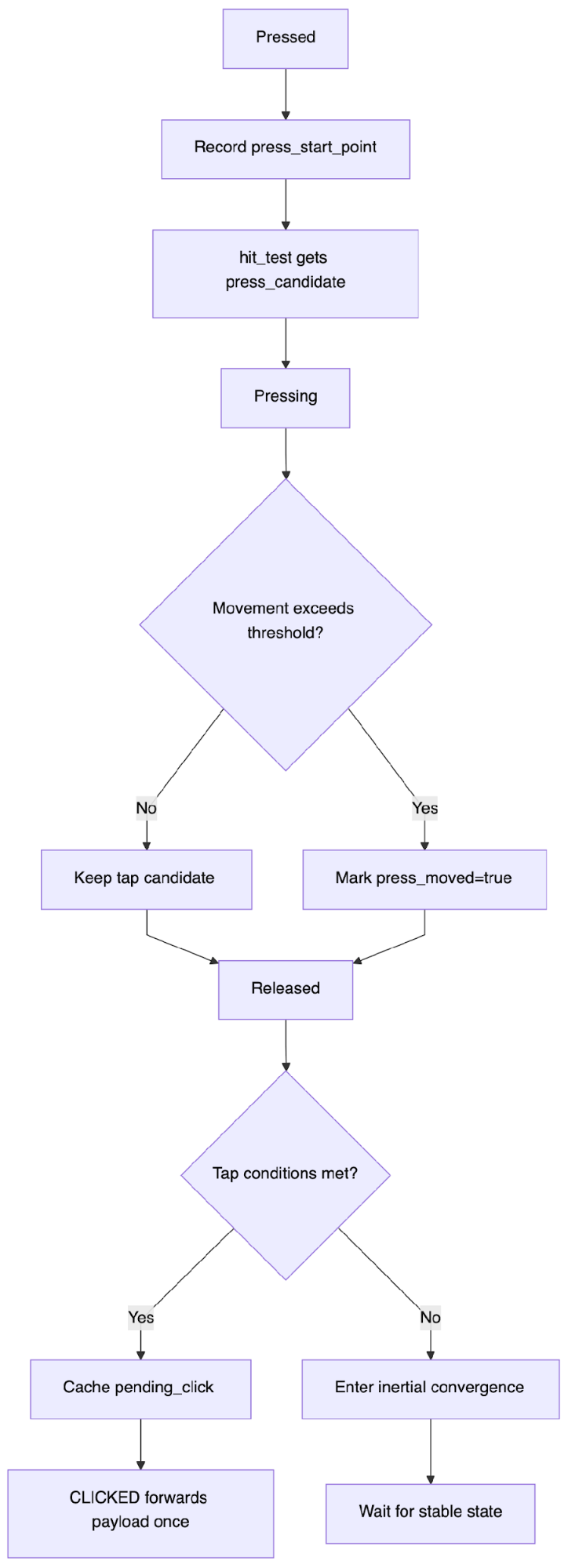
Input Algorithm: How Tap and Drag Coexist#
State Machine#
Input events are split into three types:
pressed: record start point and candidate iconpressing: accumulate displacement and velocityreleased: determine tap or enter inertia
Mapped to LVGL, this corresponds to three event callbacks:
LV_EVENT_PRESSEDLV_EVENT_PRESSINGLV_EVENT_RELEASED
Only update state inside these callbacks; do not run complex physics integration there. Physics integration is unified in the timer.
Tap Detection#
Tap is not determined only by hit result on release. It must satisfy both:
- Movement does not exceed threshold
TAP_MOVE_TOLERANCE - The release hit icon matches the press candidate
This prevents accidental taps caused by sweeping across icons while dragging.
One more engineering safeguard:
- Cache
pending_clickdata on release first. - Forward custom payload only once in the
LV_EVENT_CLICKEDhandler.
This prevents duplicate click dispatch in the input pipeline.
Hit Priority#
During hit testing, if multiple icons overlap at the touch point, choose the icon with the larger scale.
The reason is straightforward: visually larger icons appear in front and should match user expectation for hit priority.
Physics Algorithm: Damping, Spring, and Snap in Coordination#
The timer advances the discrete system at fixed steps, updating offset and velocity every frame.
A key implementation mindset is to treat it as an explicit iterator:
- Predict new state from previous frame.
- Apply constraints to new state (clamp, snap, overscroll compression).
- Truncate tiny velocities to 0 to avoid endless micro-jitter.
When state delta falls below threshold, the system enters idle state and no longer repaints continuously.
X Direction#
The X axis emphasizes recentering:
- Velocity decays by damping.
- Then a spring term toward center is added.
offset_xis clamped bymax_x_offset.
Behaviorally: horizontal motion is allowed, but it naturally returns to center.
This is essentially a one-dimensional damped spring system:
v(t+1) = d·v(t) + k·(x_target - x(t))
x(t+1) = x(t) + v(t+1)
where d is the damping coefficient and k is recenter stiffness.
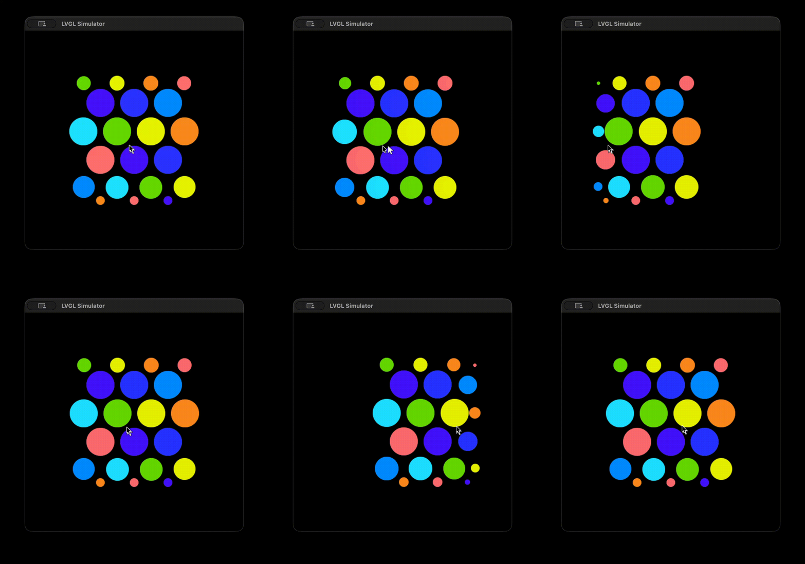
Y Direction#
The Y axis emphasizes scroll feel:
- Overscroll is allowed during drag, with rubber-band compression.
- On release, snap to nearest ratchet step.
- Out-of-bounds regions use stronger rebound terms.
Two forces are combined here:
- Spring force for deviation correction.
- Damping force for oscillation suppression.
A dead zone determines whether behavior leans toward soft snapping or strong rebound.
Y is more complex because it simultaneously carries:
- Scroll feel
- Overscroll rubber-band feel
- Discrete step snap feel
These goals conflict, so a segmented strategy is used instead of one single equation.
Press Animation: Local Deformation Rather Than Global Transform#
Press feedback includes three parts:
- Pressed icon shrinks and darkens.
- Nearby icons are slightly pulled toward the press point.
- On release, entry/exit animation follows the corresponding speed state.
The key point: this is a local perturbation on nearby nodes and does not break global layout solving. So feedback is obvious, while users do not feel that "the whole grid is shaking."
In implementation, this part is not complicated in essence. It is interpolation driven by "press progress."
Why It Darkens and Shrinks on Press#
After a hit icon is pressed, the component records pressed_icon_index and sets press_anim_target to 1. On each timer frame, press_anim_progress moves gradually toward the target, so press animation appears smooth rather than instantaneous.
When an icon is the current press target, two things happen:
- Shrink: interpolate scale from 1.0 to
PRESS_SCALE, then write back object size. - Darken: compute darkening intensity using the same progress and apply it to bubble background color and icon image recolor opacity.
Visually, it feels like the icon slightly sinks when pressed, with subtle darkening for better tactile response.
How Nearby Objects "Move Closer"#
Use the pressed icon center as reference; for other icons, decide participation by their distance to this center:
- If distance exceeds influence radius, do not move.
- The closer the distance, the larger the pull coefficient.
- Displacement direction is the normalized vector from current icon toward press center.
- Final displacement is multiplied by press progress so both press-in and release-out remain smooth.
That is why you see local convergence rather than full-screen movement.
How It Recovers on Release#
On release or when drag is detected, set press_anim_target back to 0. The timer continues interpolation: pressed icon scaling and darkening fade out gradually, and neighboring displacement returns to 0 at the same time. No separate reverse animation is needed; returning target to 0 naturally restores the state.
In LVGL terms, final updates always land on a stable set of property writes:
lv_obj_set_size()/lv_obj_set_pos()lv_obj_set_style_bg_color()- Image recolor + opacity (
lv_obj_set_style_image_recolor_opa())
Even when animation looks complex, the underlying mechanism is still interpolation-driven geometry and style refresh.
Performance Mindset: Refresh Only When Needed#
Unconditional per-frame redraw wastes performance no matter how efficient the algorithm.
The implementation uses a dirty-mark strategy:
- Mark refresh when state changes.
- Execute object update only in
refresh_if_needed.
At the same time, icon visibility evaluation performs quick culling before expensive computation. This keeps near-zero update cost in idle state while maintaining a stable frame rate during interaction.
A practical way to structure the performance strategy is two-layered:
- State layer: only mark refresh when changed.
- Icon layer: quick culling first, accurate check later.
This compresses "full solve every frame" into "solve only necessary icons + commit only necessary frames."
Design and Implementation Trade-Offs#
Use of Fixed-Point Numbers#
In the real implementation, fixed-point numbers (fx) are used to avoid floating-point cost. Coordinates and sizes submitted to LVGL are converted back to integers. For readability, this article uses terms like "coordinate" and "radius" directly, but the actual code computes in fixed-point first and then converts to integer pixels.
Why Maintain a Custom Timer?#
Using a single custom timer instead of LVGL's built-in animation system has several advantages:
-
Too many tightly coupled interactions. Press scaling, neighbor pull, edge compaction, inertia rebound, and snapping all influence each other. If LVGL built-in animations are used, many objects usually need separate animation channels, and synchronization/interruption becomes complex.
-
Interaction must be interruptible and immediately takeover-capable. On press/drag/release, state must switch immediately. Inside one unified timer, modifying
offset/velocity/press_anim_targettakes effect on the next frame without managing a large animation lifecycle. -
Physics and animation share one timeline. Inertia, spring, snap, and press progress all advance in the same tick. Each frame has a single source of truth, behavior is more controllable, and tuning is easier.
-
Fixed-point determinism. This component uses fixed-point heavily. Self-managed stepping ensures consistent numeric paths and avoids timing drift across multiple animation channels.
-
Performance and maintenance cost. When tens or hundreds of bubbles are active, unified refresh (with culling) is usually more stable. Otherwise, each object running its own animation significantly increases scheduling and state-management overhead.
References#
Deconstructing the Iconic Apple Watch Bubble UI