The LVGL Pro Editor is a powerful tool for embedded UI development, but as any seasoned developer knows, a powerful tool is only as good as the workflow behind it. Without a solid structure, a small project can quickly turn into a maintenance nightmare of messy XML and conflicting asset names. To help you build cleaner, more professional interfaces, we've compiled the ultimate guide to LVGL Pro best practices.
1. Naming Conventions#
Consistency is key. When your project grows to dozens of screens and hundreds of assets, clear naming ensures you aren't hunting for files.
Project & Asset Naming#
- Assets: Always use descriptive prefixes.
- Images:
icon_home,img_background - Fonts: Use the format
font_size_weight(e.g.,font_16_bold). This is vital when managing long lists of varying sizes and formats.
- Images:
Never name your project lvgl. This causes namespace conflicts with the library itself. Choose a unique name specific to your product.
Styles & Subjects#
Prefixing allows for better filtering in the editor and clearer code generation.
- Styles: Use
style_. If you support multiple themes, include the theme name:style_dark_buttonorstyle_light_button. - Subjects: Use
subject_(e.g.,subject_settings).
Widgets#
To distinguish components from widgets, use the wd_ prefix:
wd_menu,wd_statusbar,wd_clock.
2. Organized Resource Management#
Mixing raw source files with generated code is a recipe for accidental deletions.
Recommended Structure: Keep your raw .png files in a dedicated subfolder within your images directory.
- icon_home_20dp.png
- img_background.png
- icon_home_20dp.cGenerated output
- img_background.c
Always include the size (e.g., _20dp) in the filename for icons that exist in multiple resolutions.
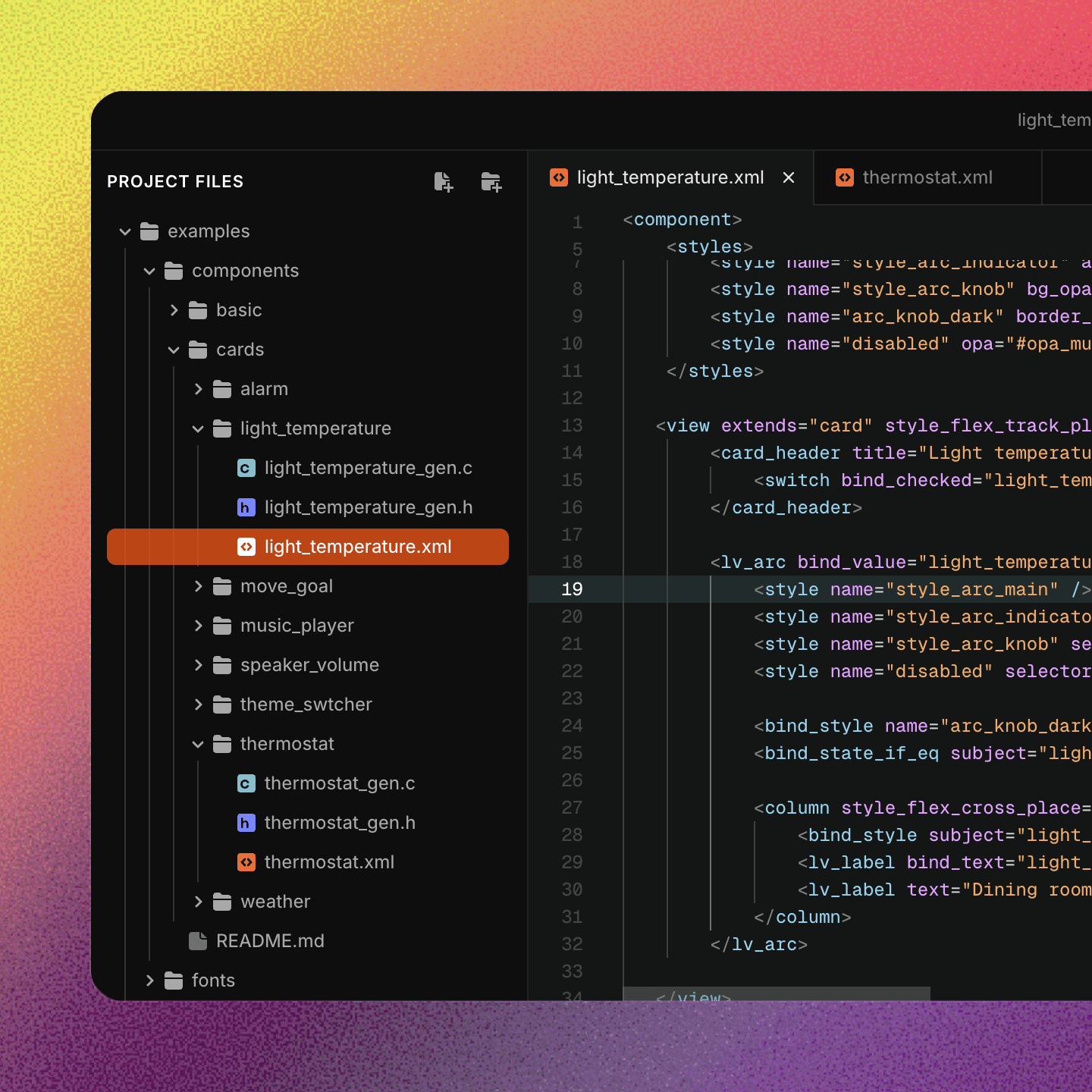
3. Architecture: Screens, Components, and Widgets#
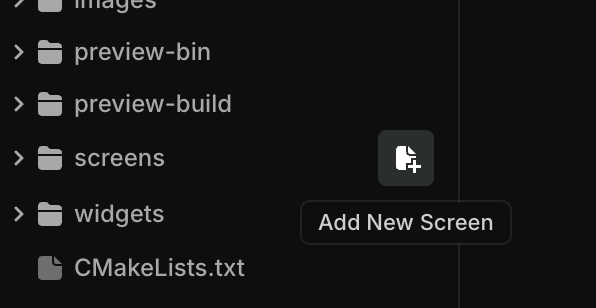
Don't dump everything into the root directory. Use the Add New Component / Widget / Screen workflow. This automatically organizes files into subfolders, keeping the project tree navigable.
The "Golden Rule" of Generated Files#
- Need a change? Modify the source XML.
- Need custom behavior? Use the provided API, external logic hooks or custom widgets.
Any manual changes made to the generated C files will be lost the moment you hit "Export Code" in the editor.
4. Writing Clean, Reusable XML#
The way you define your UI in XML determines how flexible your interface is.
Avoid Inline Styles#
Inline styles make your XML bloated and hard to update. Instead, define reusable styles.
<lv_obj style_bg_color="0x000000" style_bg_opa="255" /><styles>
<style name="style_main_bg" bg_color="0x000000" bg_opa="255" />
</styles>
<lv_obj>
<style name="style_main_bg" />
</lv_obj>Smart Component Sizing#
To make components truly reusable, avoid "double-locking" sizes. If both the container and the child have fixed widths, the component becomes rigid.
- Bad: Component root is
contentwidth, Child is420px. (Hard to resize). - Good: Component root is
420px, Child is100%. (Child scales with the component).
5. Component API & State Safety#
When building custom components, be careful not to "clobber" internal editor properties.
- Document your API: Use the
helpproperty so other team members know what a property does:
<api name="text" type="string" help="Sets the label text of the header" />- Keep Defaults Clean: Avoid overriding default flags (like
checked="true") on the root of a component. It's better to set these specific states when you actually place the component onto a screen.
Do not use name as an API property. It often conflicts with Editor-specific logic.
Learn More#
For a deeper dive into everything covered in this guide, check out the official LVGL Pro documentation.
Learn more about XML-based UI definition, component architecture, and code generation in the full LVGL Pro documentation.
Summary#
By following these patterns (consistent prefixing, separating raw assets, and using reusable styles) you ensure that your LVGL Pro project remains maintainable for years to come.
