

Scale (lv_scale)
Linear or circular scale with configurable range, ticks, labels, and color sections.
Overview
The Scale widget shows linear or circular scales with configurable ranges, tick counts, placement, labeling, and subsections (Sections) with custom styling.
Mode
When a Scale Widget is created, it starts out in MODE
LV_SCALE_MODE_HORIZONTAL_BOTTOM. This makes the scale horizontal
with tick marks below the line. If you need it to have a different shape, orientation
or tick position, use lv_scale_set_mode(scale, mode), where mode can
be any of these values:
-
LV_SCALE_MODE_HORIZONTAL_TOP -
LV_SCALE_MODE_HORIZONTAL_BOTTOM -
LV_SCALE_MODE_VERTICAL_LEFT -
LV_SCALE_MODE_VERTICAL_RIGHT -
LV_SCALE_MODE_ROUND_INNER -
LV_SCALE_MODE_ROUND_OUTER
The round variants additionally honour angle_range (the sweep in degrees)
and rotation (offset of the first tick from 3 o'clock):
Setting range
A Scale starts its life with a default numeric range of [0..100] and a default angular range of 270. You can change these ranges with:
where min and max will become the numeric low and high values for the Scale,
and angle_range is the angle between the low and high ends of the Scale.
Tick drawing order
Ticks are drawn under the main line by default. Pass true to
lv_scale_set_draw_ticks_on_top(scale, true)
to paint them on top instead.
Configuring ticks
lv_scale_set_total_tick_count(scale, n)— total number of ticks drawn.lv_scale_set_major_tick_every(scale, n)— every Nth tick is a major one.lv_scale_set_label_show(scale, true)— show/hide numeric labels next to major ticks.
By default the labels show the numeric scale value at each major tick.
Override the strings with
lv_scale_set_text_src(scale, labels) —
the array must be NULL-terminated and outlive the widget.
static const char * custom_labels[] = {"Lo", "Med", "Hi", NULL};
lv_scale_set_text_src(scale, custom_labels);
Tick length and radial offset are configurable through style properties
on LV_PART_INDICATOR (major ticks) and LV_PART_ITEMS (minor ticks):
length sets the tick length; radial_offset shifts the tick inward or
outward (round scales only); pad_radial on the indicator offsets the
label from its tick.
Rotating labels (round scales)
style_transform_rotation on LV_PART_INDICATOR rotates every label by
the given angle (units of 0.1°). Two special flags are recognised on
round scales:
LV_SCALE_LABEL_ROTATE_MATCH_TICKS— rotate each label to match its tick angle.LV_SCALE_LABEL_ROTATE_KEEP_UPRIGHT— flip labels that would otherwise appear upside down.
The flags combine with each other and with a fixed offset:
lv_obj_set_style_transform_rotation(scale,
    LV_SCALE_LABEL_ROTATE_MATCH_TICKS | LV_SCALE_LABEL_ROTATE_KEEP_UPRIGHT + 200,
    LV_PART_INDICATOR);
Styling
Three stylable parts:
LV_PART_MAIN— the rail line (or arc on round scales)LV_PART_ITEMS— minor ticksLV_PART_INDICATOR— major ticks and their labels
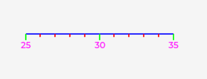
Use line-family properties (line_color/line_width/line_opa) on each
part. LV_PART_INDICATOR also picks up text properties for the numeric
labels. transform_rotation on the indicator tilts every label (units of
0.1°) — useful when dense labels overlap.
Drawing customisations
Style attributes can colour ticks and labels uniformly, but per-tick or
per-label customisation needs a draw event. The scale emits
LV_EVENT_DRAW_TASK_ADDED once per draw task; for label tasks
base_dsc->id1 and id2 carry the tick index and tick value, which is
enough to mutate the label text or recolour individual entries:
Sections
A Section is a sub-range of the Scale with its own style overrides — use it to draw a coloured "red zone", a highlighted band, etc. When sections overlap, the most recently added wins.
Creating Sections
lv_scale_section_t * sec = lv_scale_add_section(scale);
lv_scale_section_set_range(sec, 80, 100);
A fresh section has range [0..0] and no styles, so it won't draw until
both are set. Setting a range outside the scale's own range silently
hides the section — a quick way to toggle it off
(lv_scale_section_set_range(sec, 0, -1)).
Data binding
Data bindings connect a widget property to a piece of global data — a Subject. When the subject's value changes, every widget bound to it updates automatically; and an interactive widget can write back into the subject so other subscribers see the new value.
A Scale Section binds its minimum and maximum to Subjects. The link is one-way (Subject → Widget): application-side writes into either subject move that end of the section band. Only integer subjects are supported.
-
lv_scale_bind_section_min_value(scale, section1, subject) -
lv_scale_bind_section_max_value(scale, section1, subject)
Styling Sections
Attach a style to a section with
lv_scale_section_set_style(section, PART, &style).
PART must be one of LV_PART_MAIN, LV_PART_ITEMS, or
LV_PART_INDICATOR — they can't be OR'd. To restyle multiple parts,
attach the same style object to each part separately. Each (section, part)
pair holds exactly one style; setting again replaces, not adds.
Relevant style properties per part:
| Part | Properties |
|---|---|
LV_PART_MAIN (line) | line_width, line_color, line_opa |
LV_PART_MAIN (arc) | arc_width, arc_color, arc_opa, arc_rounded, arc_image_src, pad_radial |
LV_PART_ITEMS / LV_PART_INDICATOR | line_width, line_color, line_opa |
LV_PART_INDICATOR labels | text_color, text_opa, text_letter_space, text_font |
pad_radial applies only to sections drawn as an arc. Positive values move
the section arc toward the center.
Needles
Needles are used to indicate a specific value for ..._ROUND_... Scales only.
They can be lines or images and can be customized in terms of length, color, and
other properties.
Creating Needles
Create a lv_line or a lv_image Widget and then attach it to the Scale as a needle with the appropriate function:
-
lv_scale_set_line_needle_value(scale, needle_line, needle_length, value) -
lv_scale_set_image_needle_value(scale, needle_img, value)
A round-inner scale with a line needle and an image needle, both driven by a periodic timer that sweeps their values — the typical gauge pattern. Needles aren't yet exposed through XML, so this example is C-only:
Data binding
Data bindings connect a widget property to a piece of global data — a Subject. When the subject's value changes, every widget bound to it updates automatically; and an interactive widget can write back into the subject so other subscribers see the new value.
A Scale needle binds its value to a Subject. The link is one-way (Subject → Widget): application-side writes into the subject sweep the needle. Only integer subjects are supported.
-
lv_scale_bind_line_needle_value(scale, needle_line, needle_length, subject) -
lv_scale_bind_image_needle_value(scale, needle_img, subject)
Events
In LV_EVENT_DRAW_TASK_ADDED events, a major or minor line
draw descriptor's members id1 and id2 will be the tick index and
tick value, respectively. If the part is LV_PART_INDICATOR,
it is a major tick. If the part is LV_PART_ITEMS it is a
minor tick.
Learn more about Events emitted by all Widgets.
Showcase examples
These C examples combine the features above into full mini-widgets. Use them as a starting point for dashboards and gauges.
Heart-rate monitor
A round-inner scale split into five colour zones with a live BPM readout.
Sunset / sunrise widget
A round-outer scale split into day and night arcs with sunrise and sunset labels.
Compass
A round scale rotating beneath a fixed arrow as its heading sweeps 0..360°.
Last updated on